HI SMILE Rebranding/ Packaging Design
Overall, I displayed a strong knowledge on font pairing, color theory, design layout, packaging design and rendering.
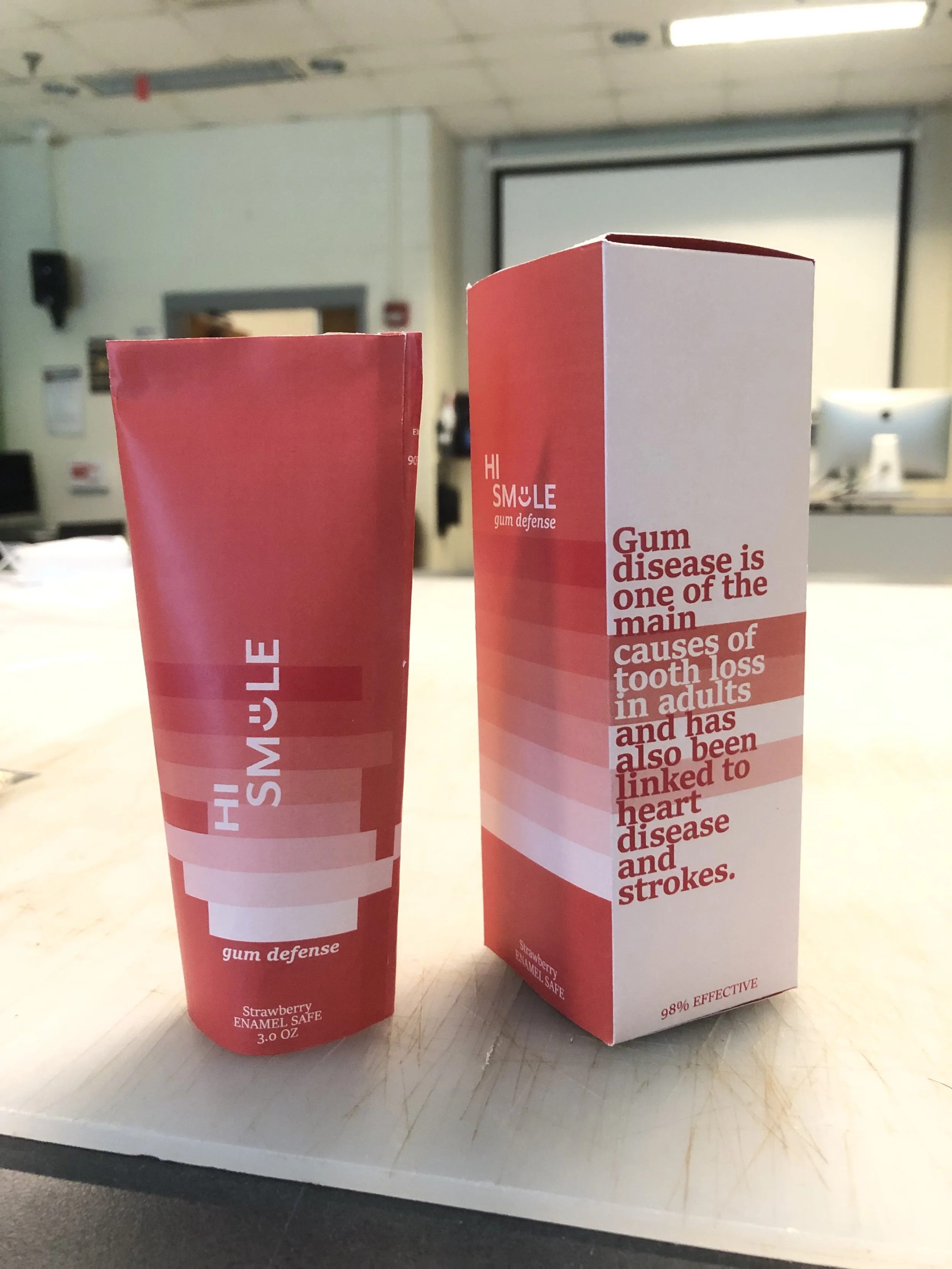
To meet the completion goals of this project, I started with their logo. I changed their logo by adding a smile into the place of an “I” to play onto the word itself. The fonts I chose deliver valuable information for the companies branding complimenting themselves as serif and sans-serif fonts. The body font is still playful but sophisticated. The colors that I choose also convey this idea staying on brand for the company. I wanted the eyes of the buyer to follow the lines around the packaging so that the information would be read. To do so, I added horizontal bold lines in different shades of the main color.